Over the past several years, accessibility has become a hot topic due to lawsuits levied against big corporations. Companies like Winn-Dixie, Nike, Dominos, and even Queen Bey herself have been unable to escape the long arm of the accessibility law. Oftentimes when organizations want to get started with web accessibility, they focus only on avoiding lawsuits and avoiding paying hefty fines—overlooking the main point of accessibility: creating a better, more inclusive experience for their customers. Web accessibility allows users with vision/hearing impairments, motor issues, and cognitive difficulties the ability to interact with your content the way an average user would by removing barriers to entry.
A majority of companies believe that becoming compliant requires sacrificing their branding and a lot of work from web developers. While some development may be needed to bring a website into full compliance, many issues can be corrected easily by content creators and editors just by knowing what to look for during standard setup and maintenance. After testing many websites, here are our top 5 findings of easily fixable and avoidable issues.
1. Insufficient Color Contrast on Text
This issue affects almost every website we have ever tested, and according to WebAIM’s recent test of 1,000,000 websites, it occurs on over a whopping 86% of website homepages.
Text must sufficiently stand out from any background color for those with visual impairment or color blindness. This is measured in terms of contrast ratio. The Web Content Accessibility Guidelines (WCAG) require text to have a minimum contrast ratio of 4.5:1 to be considered compliant.
While that information is all well and good, how can you be sure that your text meets that ratio?
Easy! All you need is a contrast checker like the Colour Contrast Analyzer or a Chrome plugin like WCAG Color Contrast Checker.
These tools allow you to quickly check your contrast levels using an eyedropper tool or, in the case of the Chrome plugin, automatically. You can even plug in alternate colors into each plug-in’s hex tools to see if an alternate color yields a better contrast ratio. Keep in mind, the higher the ratio, the better the contrast.
Good Contrast:
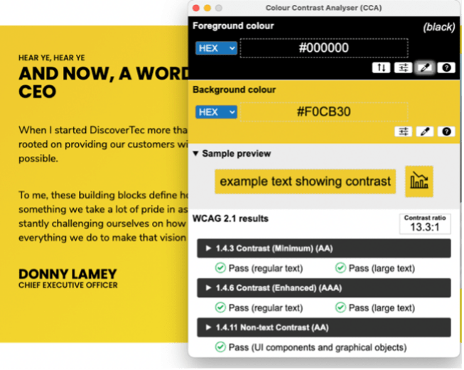
In this example we see black text against a yellow/gold background. Very legible, easy to read and uber compliant with a contrast ratio of 13.3:1
Bad Contrast:
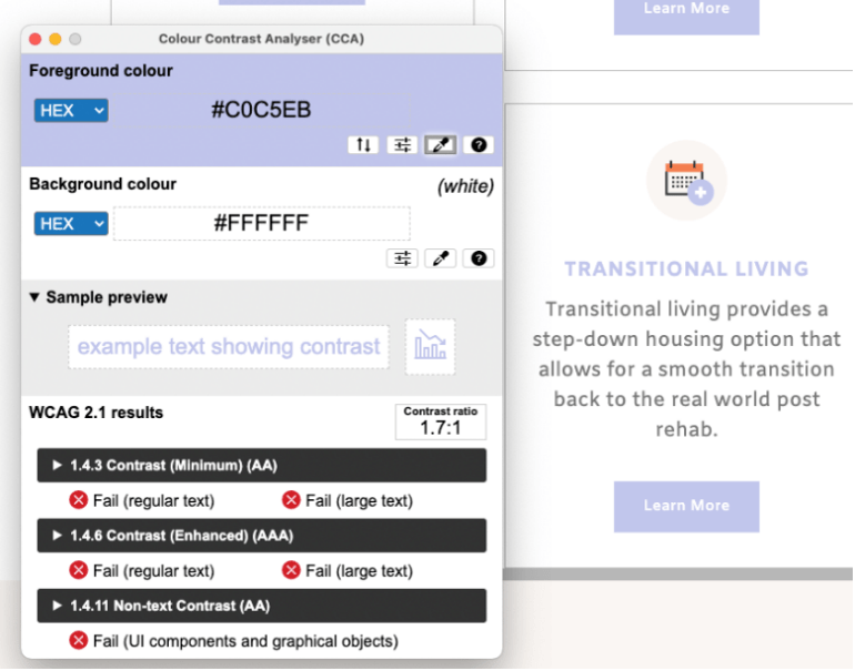
Here we see a bluish/purple color for text. While this color may be part of someone’s brand, it does not provide enough contrast when used against a white background, coming in at a ratio of 1.7:1
2. Missing/ Incorrect Image Alt Text
This issue is probably the simplest to fix since most content management platforms, and other web builders have a dialog box for alt text available when you upload or add images to a page. When crafting your alt text, it's best to use simple, concise descriptions that let a user know what is happening inside the image. Avoid overly descriptive wording, which can become tedious for a screen reader user, a good rule of thumb is to keep your description under 250 characters.
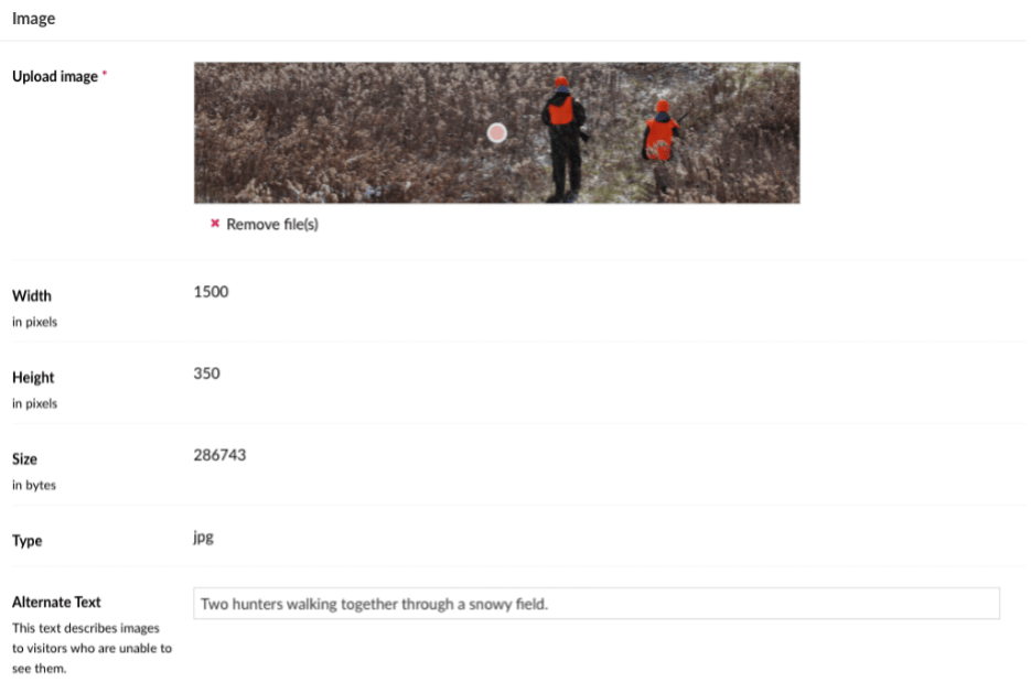
In the image above we can see an example of a content management system dialog for image uploads that allows for users to enter alternative text for an image.
However, it should be noted that not every image needs alternative text, only images that provide context to a page are required to have alt text. Images that are only used for decoration are the exception to this rule, so it is always good to be mindful of the intent of the image.
3. Ambiguous Link Text
For most users, calls to action and hyperlinks that use text like “Learn More” or “Click Here” are understood based on the context and placement of the link. But for visually impaired users who often use screen readers to scan pages or are just presented with a list of page links upon arrival at your site, it can be frustrating to continually hear “Learn More” without having any idea of what they are going to learn more about or where the link will take them! Ambiguous link text also affects those with cognitive impairments, who may become disoriented by the repetitiveness of the same link wording used over and over again.
The best way to avert this issue is to use brief but informative text that gives the link context and meaning. For example, instead of saying, "Click here" to learn about WCAG 2.1 link text,” you could use “Read the WCAG 2.1 guideline for link text.” This way you’re using more specific language and by linking more of the text, you’re also making it clear to user what is being linked to.

4. Videos Without Captions
When most people think about closed captioning and subtitles on videos, they often think they are just for the deaf, but they are A recent study from Verizon showed that 69% of videos watched are viewed without sound, and 80% of consumers are more likely to watch an entire video if captions are made available. Many viewers watch videos on the go, in public places where they can’t use sound or (in my case) have difficulty understanding what someone is saying in a movie, especially when someone is speaking in a low voice.
While adding captions to a video may seem like a daunting task, it doesn’t have to be! Several video hosting platforms allow you to add captions to your videos once you upload them. Some of these platforms can even generate captions for you using speech recognition technology. One of the best (if not the best) caption generators is YouTube, which has perfected this feature over the past several years. It is important to note though automated captions are a great starting point but, you should still take the time to review the captions and make sure they are accurate, or you could end up with some crazy caption fails.


5. Heading Hierarchy
Headings are essential on a webpage because they help break up and organize content by topic and levels of importance. Many times however, headers aren’t used based on the order of importance of a topic but instead on how they look. Designers often create headers that look a certain way or appear at a specific size and ignore the function that a header is supposed to perform – prioritizing content.
Content creators, as well, tend to pick and choose the style they want to show instead of considering the hierarchy of the content. Even worse, though, is formatting text to impersonate a header using larger font sizes and bold lettering. These pseudo headers are not picked up by assistive technology and can cause a web page's main point to be missed. This can lead to a frustrating experience for some users.
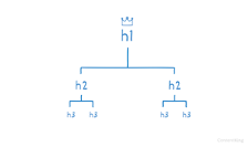
Headings in HTML are ranked <h1> - <h6> with <h1> being the most important and representing the page’s primary topic and all <h2> - <h6> considered subtopics of the main idea. There should only be one <h1> on a page, with the remaining hierarchy used in descending order. The remainder of the headers can be used multiple times on the pages as long as you don’t skip around, so don’t jump from an <h2> to an <h5> and then back to an <h3>. The easiest way to prevent this potential issue is to plan your content structure first and then lay it out on the webpage accordingly.
Knowing simple things to look for and correct when it comes to accessibility issues can go a long way in helping your company on the road to compliance and can go a long way in creating an accessibility policy for your company. Even though these issues may feel like small things, they can make a big difference for people and help reduce the burden for your users.